Monday 27 January 2014
Tuesday 21 January 2014
Photo Selections
I liked this photograph because it was showing nice settings in the background. Also the pose suits the stereotypical Hip Hop culture as it is a bit promiscuous.
I didn't use this photograph because you can see the houses and cars in the background and that looks unprofessional and I didn't want my magazine to look or have that type of feel.
I liked this photograph because its a mid/close up showing different angel variety. It shows the model smiling with her had on her face this is a unconventional pose for a Hip Hop magazine. Which I thought may draw attention to the image. And because it is a friendly and light hearted feel to it I thought it would suit being on the contents page.
Friday 17 January 2014
Use of Kuler.com - Colour Pallet

 I chose this colour pallet because I thought it showed a nice variety of colours and these are the most stereotypical conventional colours for a Hip Hop magazines. I thought it would be interesting and eye catching to have this mixture of colours I'm also going to predominately use the colour Red -I got the inspiration for Vibe magazine they do this a lot and there magazine always have the nicest style.
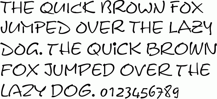
'Calvin'. This is the font I'm going to use through out my magazine I believe it anchors my genre well and it's fun and lively to look at and read with a urban twist. I think this font is un-conventional but it will make my magazine stand out more.
Subscribe to:
Posts (Atom)


